Japanese rebus monogram
A Japanese rebus monogram is a monogram in a particular style, which spells a name via a rebus, as a form of Japanese wordplay or visual pun. Today they are most often seen in corporate logos or product logos.
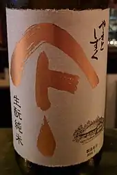
These symbols are particularly common for traditional food brands, notably soy sauce.[1] An example is the logo for Yamasa soy sauce, which is a ∧ with a サ under it. This is read as Yama for mountain (山) (symbolized by the ∧) + sa (サ).
Composition
The monogram is composed of two parts: one a Japanese character, most often kanji, but also katakana or hiragana;[lower-alpha 1] the other a simple symbol, such as a circle or square. The symbol is pronounced according to its name, and together (in either order, but generally symbol first) these form a Japanese name.
Japanese family names are generally two kanji characters, each usually of one or two morae – hence one or two hiragana or katakana if written that way – and thus can be represented as one symbol plus one kanji character, sometimes one hiragana or katakana. Only a few symbols are used, and thus only a few names can be written as a monogram this way.
A name may be represented by a symbol that does not correspond to it but is homophonous – further punning – which is aided by the large degree of homophony in Japanese. For example, kane (金, metal) in a name may be represented by the symbol ┐, though this actually corresponds to kane (矩, carpenter's square); or -en (園, ... garden) in a name may be represented by the symbol ○, though this actually corresponds to en (円, circle).
Variations
There are many variations on the basic design of rebus monograms – only one character from the name may be used, the pronunciation need not correspond to an actual name, other typographical symbols can be used (like 〆, shime),[2] two symbols (and no characters) may be used[2] – for example, Maruyama (円山) can be spelt as ○∧ – and unpronounceable or unpronounced symbols may also be incorporated decoratively.
For example, the Yamasa symbol was created as a modification of the boat emblem of the Kishū branch of the Tokugawa clan, which was composed as ∧ + キ, with the katakana character キ used for the ki in Kishū, and the ∧ being purely decorative. The Yamasa variant turned the キ character on its side and reinterpreted it as sa (サ); the resulting Yamasa reading does not correspond to an actual name (the family name is instead Hamaguchi), though it sounds like a family name and such a family name does exist (e.g., written in the form 山佐).
These readings are used for other symbols as well. Most commonly, a circled symbol is pronounced maru + (symbol reading), for "circle" (丸, maru); circling a symbol is common, dating to circular seals. A notable example is the tax inspection division (査察部, sasatsubu) of the National Tax Agency, which uses a circled sa (査) as their symbol. They are thus known colloquially as the Marusa, from maru + sa (〇査). This is notably present in the movie title A Taxing Woman (マルサの女, Marusa no onna). As katakana this would be written as ㋚; see Enclosed CJK Letters and Months for Unicode standard circled symbols.
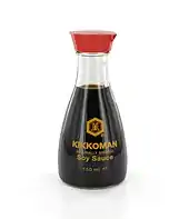
Rarer variants exist, like Kikkou man (亀甲萬, tortoise-shell 10,000) for Kikkoman soy sauce (tortoises are said to live for 10,000 years), which uses a hexagon to symbolize a tortoise shell (亀甲), with man (萬, 10,000) inside.
Common symbols
Only a handful of symbols are commonly used, though some have different readings; these are:[2][3]
| Symbol | Reading | Kanji | Description | Other character's position |
|---|---|---|---|---|
| 〇 | maru | 丸 | circle | inside the circle |
| 〇 | en | 円 | circle | |
| ∧ | yama | 山 | mountain | under the mountain |
| ┐ | kane | 矩 | carpenter's square | inside the angle |
| ┐ | kado | 角 | corner | |
| □ | kaku | 角 | box | inside the box |
| ♢ | hishi, bishi | 菱 | diamond, rhombus | inside the box |
Terminology
There is no standard everyday Japanese term for rebus monograms. Rather, they are referred to by their use, such as "trade name" (商号, shōgō),[2] "store name" (屋号, yagō),[3] etc., or generically as "symbol" (標号, hyōgō), "symbol mark" (シンボルマーク, shimboru māku),[2] etc.
History
As designs and corporate symbols, rebus monograms date at least to the mid-17th century, and early on were featured on noren. They presumably come from the graphic tradition of the battlefield flags of the Warring States Period (Sengoku period, mid-15th to early 17th century), as seen in the simple clan name designs of Sashimono and Uma-jirushi. More broadly, these come from the same heraldic tradition as mon, where family emblems are pronounced according to the design, yielding the family name, as in Mitsu-ya ("three arrows"). While many mon feature kanji taken from the family name, the mon as a whole is not pronounceable as the full name.
During the Edo period, pictorial rebuses known as hanjimono (判じ物) were immensely popular, and involved similar wordplay; see Rebus#Japan. Today the most often seen of these pictorial symbols is a picture of a sickle, a circle, and the letter nu (ぬ), read as kama-wa-nu (鎌輪ぬ, sickle circle nu), interpreted as kamawanu (構わぬ), the old-fashioned form of kamawanai (構わない, "don't worry, doesn't matter"). This is known as the "kamawanu sign" (鎌輪奴文, kamawanu-mon), and dates to circa 1700,[4] being used in kabuki since circa 1815.[5][6]
Gallery
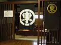
 Mon of Tottori Prefecture; the symbol is meant to represent the hiragana to (と) and a bird (tori) to form a rebus of Tottori.
See also
- 囲み文字 (Enclosed Alphanumerics, Japanese details)
- 屋号 (Yagō, Japanese details)
- Mon
- Rebus § Japan
Notes
- Katakana is frequently used due to its legibility and graphic simplicity, which are suited for use in a logo.
References
- 醤油の知識: 屋号
- 伊勢町に残る標号 (in Japanese)
- 【スタッフ日記】カネ○○、マル○○、ヤマ○○…屋号のヒミツ Archived 2013-11-12 at the Wayback Machine (in Japanese)
- かま わ ぬ [3] 【鎌輪奴▽】, 大辞林
- 鎌輪奴文 かまわぬもん
- 鎌輪奴文(かまわぬもん) 歌舞伎文様